I want to share with you my top five tips for achieving a super realistic effect with your miniature foods, tips that I’ve learned through lots of trial and error, and I’ll show you before and after pictures from my portfolio so you can clearly see how these tips will improve your work. These techniques can easily be applied to nearly any food project, so get ready to take your mini-making up a notch!
#1 Stock Up On Translucent Clay
If you ignore everything else in this post, take this tip to heart. There might be an exception out there, but I honestly can’t think of a single food that doesn’t require translucent clay if you’re aiming for realism. Here’s an example of a marble pound cake I made about a year ago. The texture looks a little too heavy and opaque for my taste, because I didn’t add enough translucent clay.
Contrast with a lemon pound cake that I made this month (the loaf on the right), to which I added a great deal of translucent clay, giving it a yummy, moist appearance.
#2 Get Messy
This tip is something I’ve only recently begun to embrace, and I love the way it has transformed my pieces. My work is heavily influenced by food photography in magazines like Martha Stewart Livingand Gourmet, and what I failed to grasp when I was starting out as a sculptor is that even the most perfect of still life photos still contains an element of calculated mess. My foods were too neat and tidy, and as I’ve incorporated a bit of carefully planned messiness in my work, they now seem more realistic to my eye.
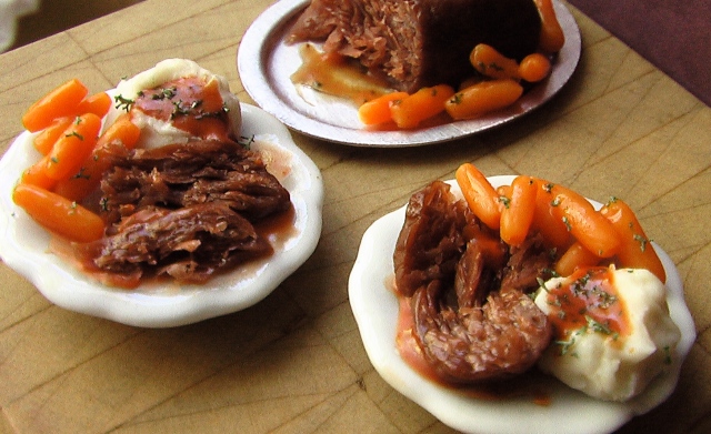
Here is my earliest attempt at roast beef, which I did over a year ago, and in fact, this might be the first time I ever made meat. Notice how neat and tidy the plate is–no juice puddling under the beef, the sweet potato mash hasn’t lost its perfect mound shape, and the roll is like a piece of plastic.
Here’s a roast beef dinner that I made recently. I incorporated a wider range of textures, and the foods merge together much like they would on a real plate (no matter how hard you might try to keep everything separate!).
#3 Use Your Mistakes
Oftentimes while I’m working, the clay will behave in a way that I hadn’t anticipated or desired, maybe because my hands are too hot or I’m using a tool that’s not well suited to the task at hand. What I’ve come to realize, however, is that every mistake is an illustration of another way to do things; it might not be right for my current project, but it could be perfect for another piece. Here’s an example of what I mean.
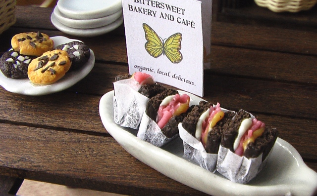
When the clay is cold or unconditioned, it has a tendency to crack at the edges when you try to roll it out, and for projects needing smoother edges, this is a bummer; however, that same cracked edge is ideal for creating realistic sliced roast beef, such as that used in these Reuben sandwiches. It’s a little hard to see, but you can get a closer look by clicking on the photo to enlarge the image. Bottom line: Make a mental note of interesting mistakes (or better yet, take a picture); you never know when they might come in handy!
#4 Really Look at Real Foods
If you’ve ever taken a drawing class, your instructor may have given you the directive, “Work from life,” and the same applies to miniature food. We all know what cake looks like, but before I start sculpting a tiny version, I pull out my inspiration folder and look at cake photos, examining the color, the texture of the crumbs, etc. Give it a try. Next time you’re sculpting, treat yourself to some eye candy beforehand, and really pay attention to the details. Don’t make assumptions or operate on auto-pilot, and you might be pleasantly surprised by the details that surface up in your work.
These are some of the very first pieces I ever made, and I was working from my imagination of what I thought bread looked like.
And here’s an example of bread I made over a year later after poring over photos upon photos of artisan loaves.
#5 Show Action and Process
This is another tip that I’m only just beginning to use in my own work, and I love the results. Here’s what I mean by showing action: Rather than creating a slice of cake on a plate, why not include a fork and a bite being taken out of the slice? It immediately adds realism because the viewer can’t help but imagine someone taking a nibble of your cake, which is much more exciting than a static piece of food, untouched by life. (Heh…that sounds a bit deeper than I intended.)
Here’s a slice of cake, all by its lonesome.
And here’s a slice from which someone’s about to take a tasty bite before washing it down with a sip of hot coffee. Mmm…who’s hungry?


January 25, 2013 at 4:09 pm
love the ideas thanks so much for the tips
January 25, 2013 at 4:13 pm
Thanks for reading! Glad they were helpful. 🙂
February 2, 2013 at 1:37 am
I am a 53 yr. old gramma, whose art has been confined to needle thingies. But I long to give the miniature world a try, especially seeing I have 3 grand girls, and a sweet husband who cut a hole in my dining room wall to make me a pixie house! Your tips and tutorials give me the starting place I was looking for, so a BIG THANKS! Best Wishes, Linnie
February 3, 2013 at 3:30 pm
How fun, Linnie! I’m so excited that you’re going to start working with miniatures–you’re going to love them! Just be careful: They can turn into a bit of an obsession. 😉
October 13, 2013 at 12:00 am
I had a few minute and just looking around your space and came across these tips and great tips that I will be using from this point on especially being messy and adding realistic effects!!!! Thank You!!!!!
October 14, 2013 at 4:18 pm
I’m so glad this post was helpful for you, Dorothy!
October 15, 2013 at 6:56 pm
[…] the cake section, which has been expanded to include brand new techniques for even more realistic results, as well as specific recipes for new favorites, like rainbow cake, Funfetti cake, and cake pops. […]
November 8, 2013 at 8:43 am
muchisimas gracias por todos esos grandisimos consejos, son mas que utiles ,
besitos
Mari
November 8, 2013 at 1:19 pm
Thanks, Mari! I’m so glad they were helpful.:D xx
July 15, 2014 at 8:20 pm
I am a 66 year old gramma,,I love your site. I just made my first Fairy house, have 6 new fairies and going to start on making a bakery for them. I have been cooking and baking my entire life and your bread makes my mouth drool,,,looks fantastic and verrrry real!! Going to start with bread, then cakes and work my way up to Danish pastries & puff pastry items. I think I will have to purchase a few bakers racks.. Thanks for the great ideas and pics.
July 15, 2014 at 8:37 pm
Hi, Jan–thanks for reading! I LOVE your idea of making a fairy bakery! 🙂 When you finish it, if you want to send pics I would be super excited to see what it looks like. You can email them to me at info[at]themousemarket[dot]com. And just let me know if you need any baking supplies that aren’t in my shop; I’d be happy to check with my supplier. I also have some free tutorials, including one for an almond cake and chocolate croissants, here.